Hot Pink Cake Smash Session in Chicago
Hot pink is not for the faint of heart, and that is exactly why parents who choose it love it. Where blush and pastel pink are soft and gentle, hot pink is bold, confident, and unapologetically fun. It creates cake smash images that practically jump off the screen.
This session was one of those sets where everything just clicked. The hot pink cake against the studio backdrop, the matching balloons, the tutu — every element worked together to create something vibrant and joyful.
Going Bold with Hot Pink
The key to a hot pink session is balance. You want the pink to be the star without the set feeling overwhelming. Here is how we approached it:
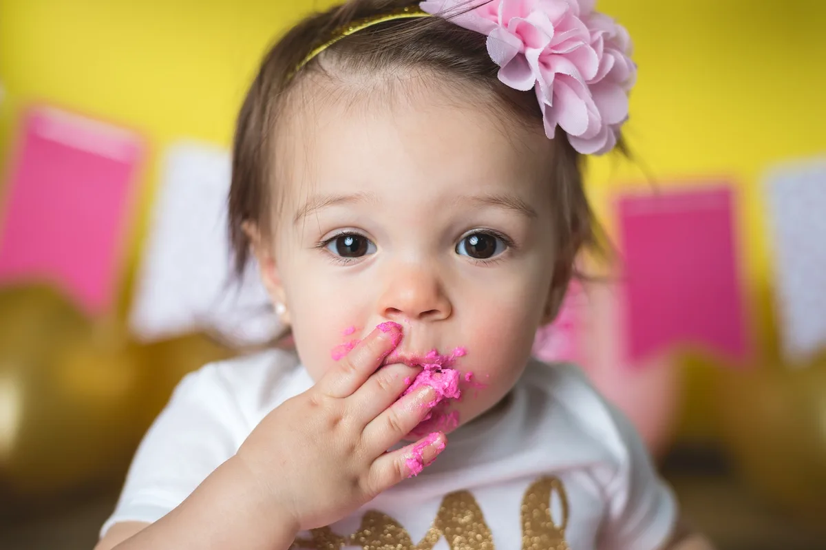
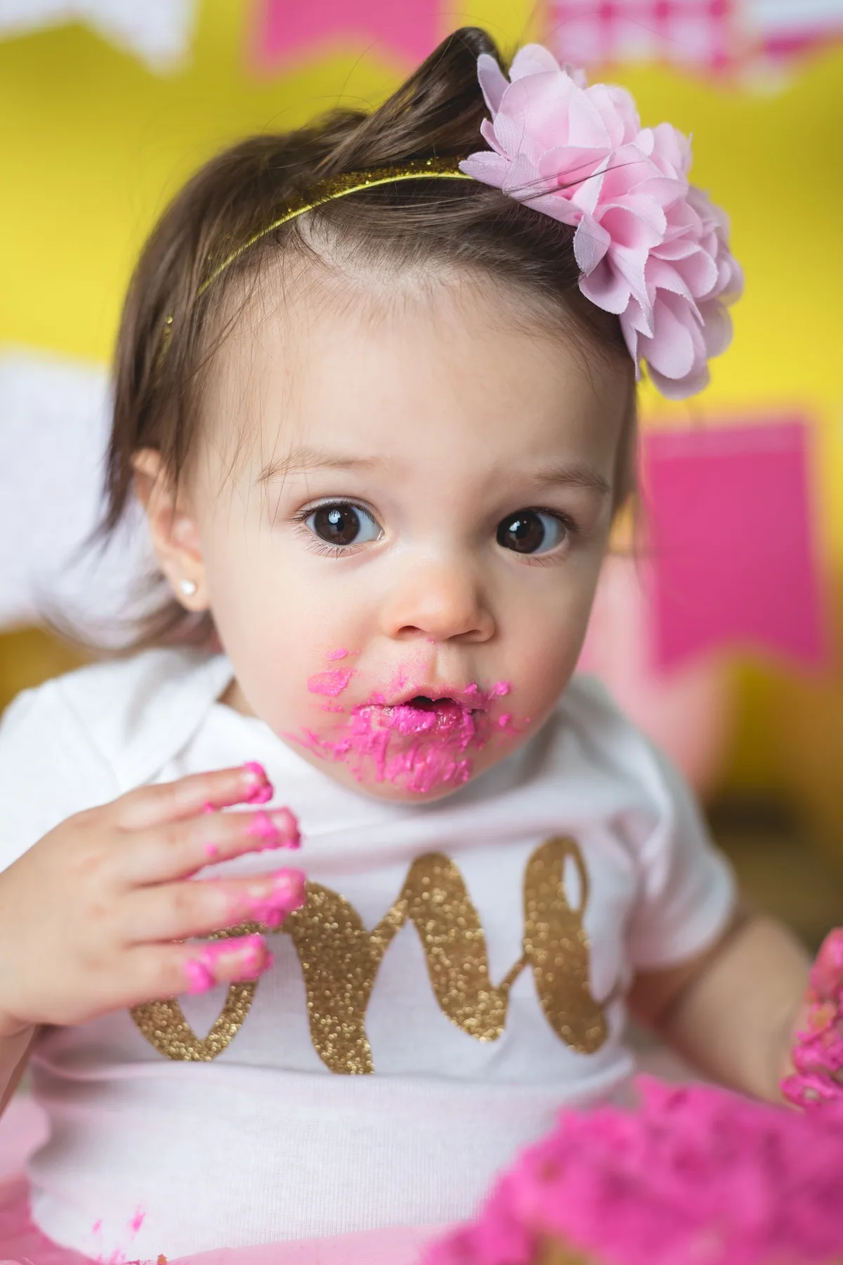
- The cake — A vivid hot pink frosted cake that anchored the entire color scheme. We went bold on the cake because that is where the action happens — it needs to read clearly even when covered in baby hands.
- Balloons — Hot pink balloons mixed with a few white ones. The white creates breathing room so the pink does not feel relentless.
- Banner — A birthday banner that complemented the pink without matching it exactly. A slight variation in shade adds visual interest.
- Tutu — The baby wore a pink tutu that coordinated with the set. When the outfit and the set are in the same color family, the whole scene feels intentional.
- Number sign — A number one sign in a coordinating shade added the birthday milestone element.
Hot pink creates a bold, celebratory atmosphere that translates beautifully to print.
Hot Pink vs. Blush vs. Pastel Pink
Pink is the most requested color family at our studio, but the shade matters enormously:
- Blush pink — Soft, romantic, delicate. It creates a gentle, dreamy aesthetic. Most popular for parents who want something classic and understated.
- Pastel pink — Brighter than blush but still soft. Think bubblegum. It is cheerful without being intense.
- Hot pink / magenta — Bold, vivid, high-energy. It creates the most dramatic images and stands out in a gallery or social media feed. This is the statement choice.
- Dusty rose — Muted, sophisticated, slightly vintage. It is pink for parents who do not usually like pink.
Hot pink is the color parents choose when they want photos with personality. It is bold, it is fun, and their baby always seems to match its energy.
Pairing Hot Pink with Other Colors
Hot pink is strong enough to carry a set on its own, but if you want a second color, these combinations work well:
- Hot pink and gold — Glamorous and celebratory. Gold accents (crown, confetti, number sign) elevate the set from playful to party.
- Hot pink and black — Edgy, modern, and surprisingly sophisticated. Not what most people expect for a baby session, but it photographs incredibly well.
- Hot pink and white — Clean and bright. The white keeps the pink from feeling too intense and creates a fresh, airy backdrop.
- Hot pink and silver — Cool-toned sparkle that balances the warm pink. Works well with metallic balloon accents.
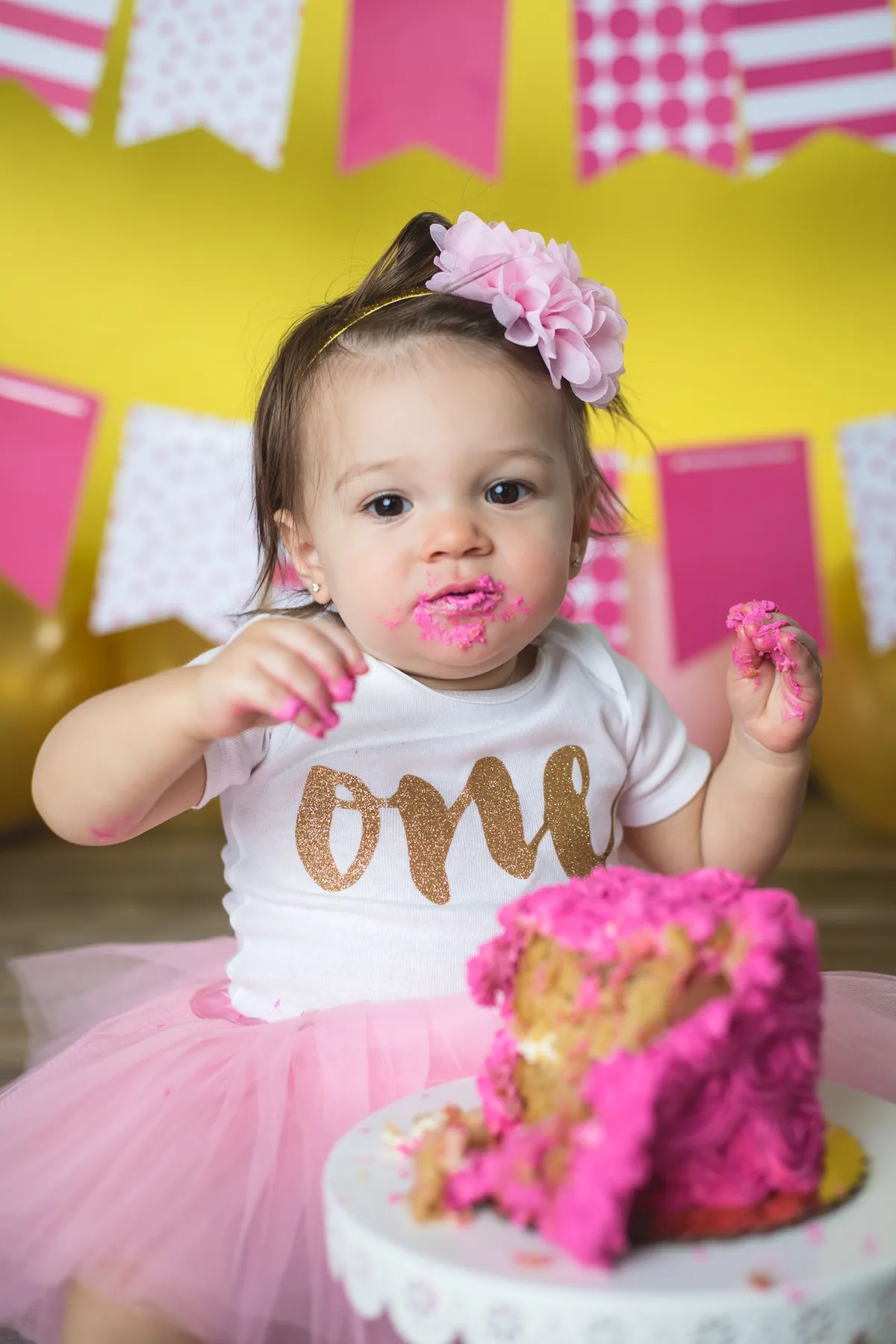
Hot pink frosting creates the most photogenic mess. The color stays vibrant even when spread across everything.
Tips for Choosing Hot Pink
- Commit to the boldness. Hot pink works best when you lean into it. Half-measures create a confusing palette. Go bold or choose a softer shade.
- Keep the outfit neutral or matching. White, cream, or a matching pink outfit works best. Avoid competing colors in the baby's clothing.
- Consider the wall art. Hot pink images look stunning as a statement print in a nursery or living room. Think about where you want to display the photos.
- Trust the lighting. Hot pink can look neon in harsh light, but under our studio lighting it looks rich and saturated without being garish.
Ready to Go Bold?
Mini sessions are $275 and include a custom cake in any shade of pink — from blush to hot pink. We will coordinate the whole set.
View Available Dates